Sawdust Arts Festival Poster
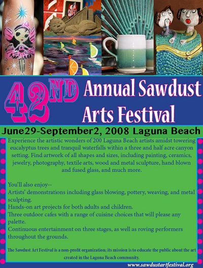
I designed my festival poster according to the Sawdust Arts Festival's website and Facebook page. This way all of their promotional materials coordinated and had a similar theme. Since it is a family-friendly event, I chose a handful of pictures from their Facebook page to represent the different ages that participated at the festival, as well as the range of art mediums. I wanted the advertisement to pop, and grab people attention, so I used bright, attention-grabbing colors and font styles.
Company Logo
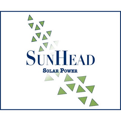
I put much thought into the design behind Sunhead Solar Power’s Logo, including the nature of their company and the type of message they would want to convey to consumers. Because this company is trying to attract consumers who are interested in more energy-efficient options and services, I chose the green and navy color palette because it looks natural and green, which are characteristics that are associated with solar power. I originally wanted to make a sun shape, but found that it looked too overwhelming and was too literal. I then decided to use elements of that design, by using just the pattern of triangles in one of the sun’s rays I created. This way, there was still a sense of a solar effect because of the triangular shapes that resembled a wavy ray, but had a much cleaner, professional effect. The feathering technique I used across the path of triangles gives a sense of movement and shadows that the sun makes. This feathering technique also infers the transition of energy that could be created by solar power. I also made the shape of the triangle path to direct vertically through the company’s name, “Sunhead Solar Power” in a left to right direction that is pleasing to the eye. This method also creates balance for the whole logo and gives it a sense of wholeness. The text style I chose for the text allows “Sunhead” to be separate from “solar power” so that it is more readable. Additionally, I used two separate fonts for the two lines so that “Sunhead” is more distinctive and prominent, yet they both are appropriately creative and professional for the company’s image.
Hollywood Menu
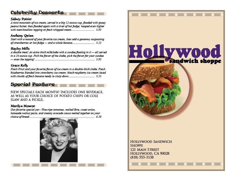
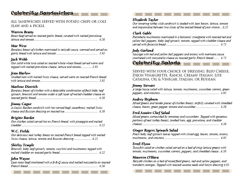
I abided by all art director and client comments, adding the logo, name and address on the cover, as well as including a special feature on the back page of the menu, and creating a design that could be printed in black and white, yet still look attractive. I used different a few different shades of neutral colors so that they would contrast even when printed in black and white, such as in the heading where I used the dots feature to draw more attention with light and dark contrast. I also used different fonts to make it more interesting, but not too many as to not look cohesive. I also used repetition with the dots, with one line of them at the bottom and top of each of the four sections, so that it would be even more cohesive and put together. White space was implemented to help ease readability and to create an attractive form. I put spaces between the headings and the subheadings (telling what each menu item came with, like chips, etc) so that they would not run together or look too crowded. The entire design comes together well and represents the image of the ‘Hollywood Sandwich Shoppe’.